


Buddy Holly's music has always held a special place in my heart. Recently, inspired by his infectious energy and timeless sound, I embarked on a creative project: reimagining Buddy Holly as a touring artist in modern-day Norway.
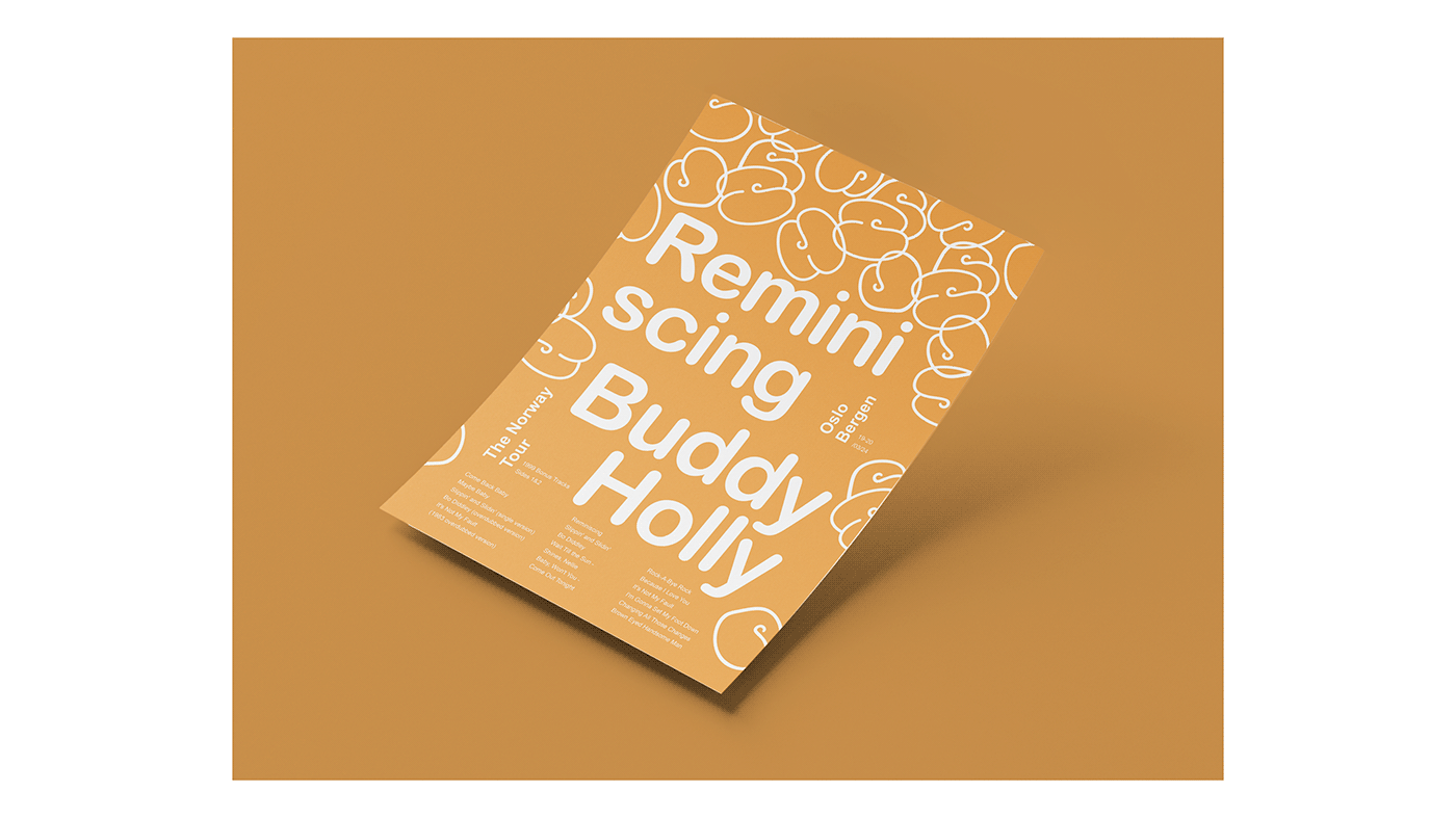
To capture the timeless joy of Buddy Holly's music, I poured it all into the core of the visual identity. Happiness was the heartthrob, the driving force. It pulsed with a whole spectrum of vibrant emotions and associations that swirled around it.

This translated to the color palette, where I blasted primary colors – bold, saturated hues that mirrored the raw energy of the music. Think electrifying blues, sunshine yellows, and a heart-stopping red – a visual representation of the pure, unadulterated euphoria Buddy Holly embodied.

The typography isn't some flashy headliner; it's the understated backbone, the quiet champion supporting the core idea. It stays clean and simple, letting the raw energy of the visuals take center stage.

All of the above sets the stage for the real star – the logo. Birthed from the heart of the visual identity, it explodes with the infectious energy of Buddy Holly's music. Balloon-like letters, a playful "B" and "H" for the artist's name, float effortlessly above the rest, becoming the signature mark for this reimagined tour.


And of course, what's a tour without a promo campaign to spread the word?
These eye-catching materials designed to reel in both lifelong Buddy Holly fans and a whole new generation.


Bringing Buddy Holly's music to life in a modern context was a truly inspiring journey.
It was an utmost pleasure sharing it with you.


